

 by
by If you’ve been following along at all, one thing you’ve learned is that we don’t think twice about going to see the collection of an artist we’d never heard of, which is how we found ourselves learning about Clyfford Still (1904–1980).
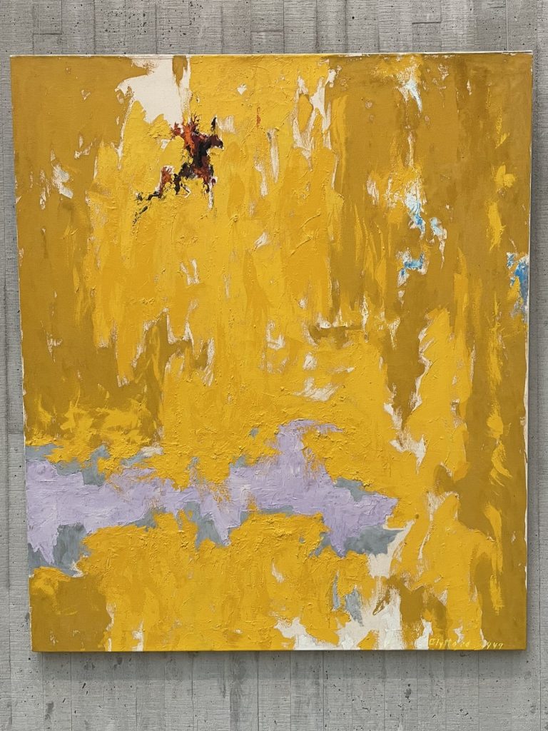
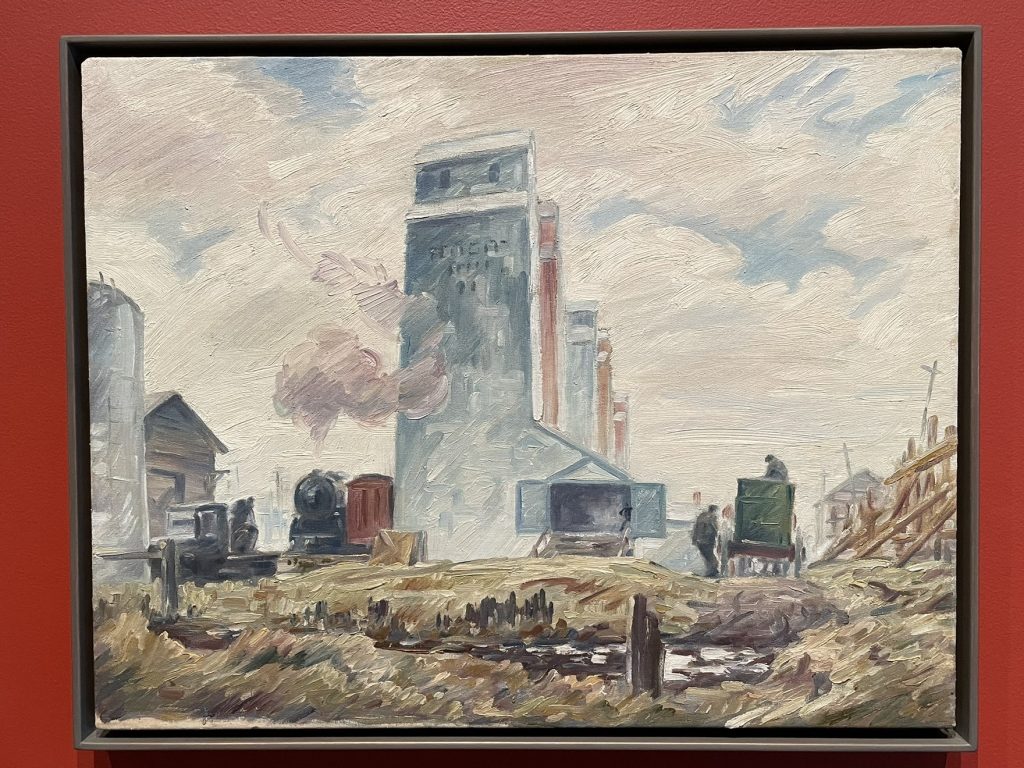
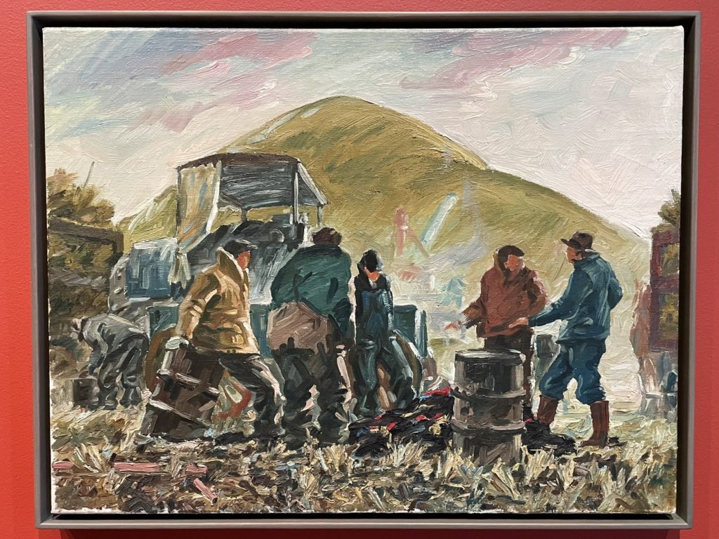
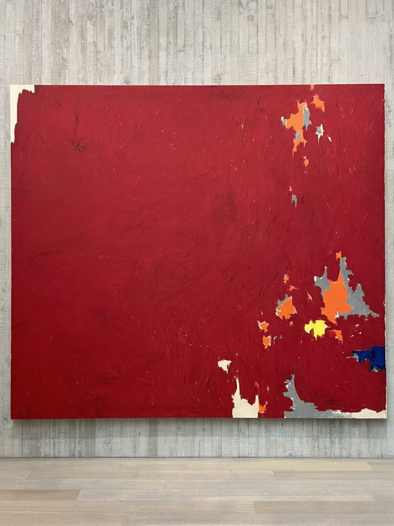
The Clyfford Still Museum in Denver, Colorado (new state!) is home to more than 3,000 works (about 1/3 of which are paintings and 2/3 are “works on paper”) by the artist – more than 90% of his lifetime output! The collection is rotated two or three times a year, so it’s clear that a future visit would be a very different experience, considering his work changed dramatically throughout the years (check out the 1929 paintings below – completely different from everything else we saw!). The exhibition during our visit was Dialogue and Defiance: Clyfford Still and the Abstract Expressionists, focusing on his work in the late 1940s and early 1950s.
Still’s will stipulated that the entire collection should be given to an American city that was willing to establish a permanent museum for it. 20 cities vied to receive it, with Denver (obviously) being chosen as the winner. The museum opened in 2011, and in addition to his artwork, is home to his complete archives, including correspondence, sketchbooks, personal items, photo albums, and more.
Still was a leading figure of the Abstract Expressionists, and also an influential professor at several art colleges. In the early 1950s, Still cut ties with all commercial galleries, wanting to maintain control over how his paintings were presented (which is why we now have so many of his paintings in one place). Per the museum’s website, he “thought the best way to experience his art was by seeing it all in one place without the distraction of, or what he thought were irrelevant comparisons to, other artists.”
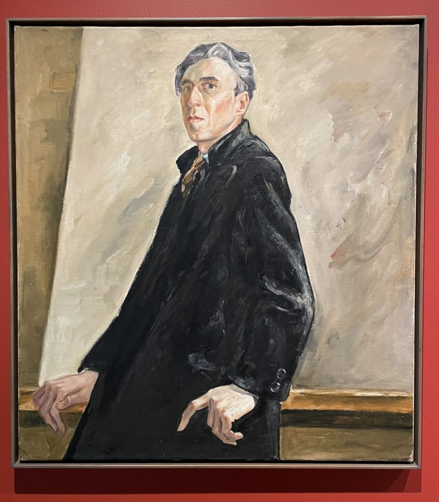
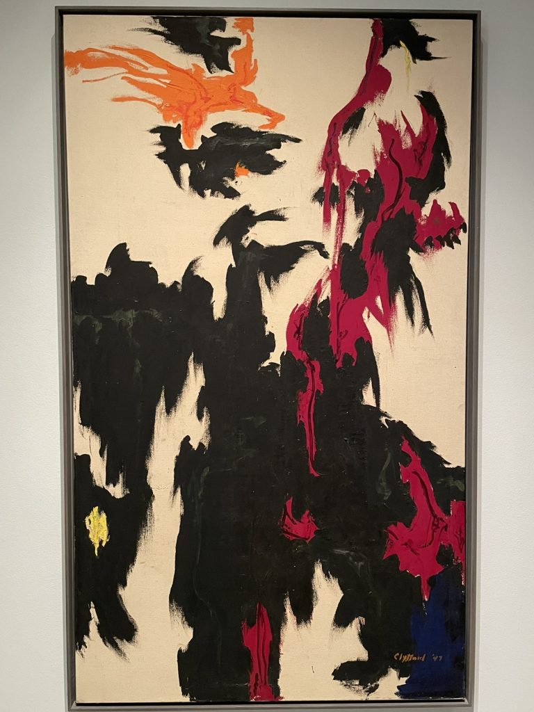
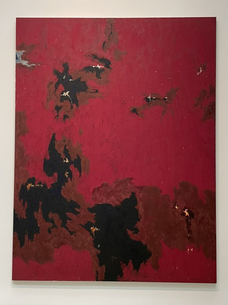
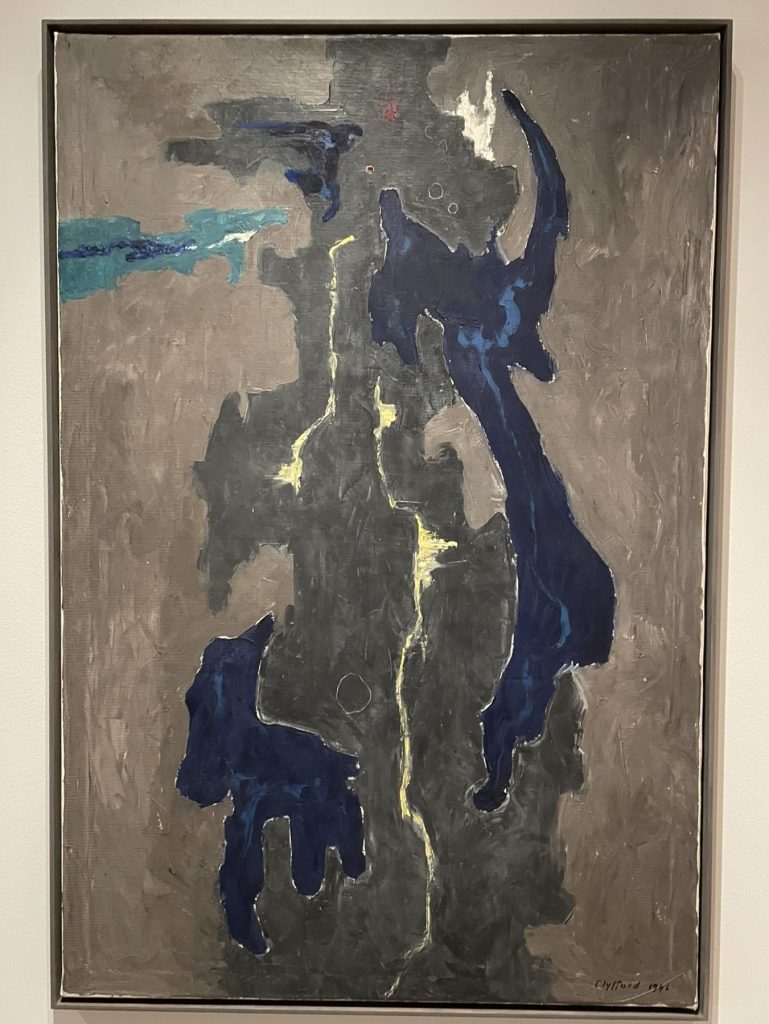
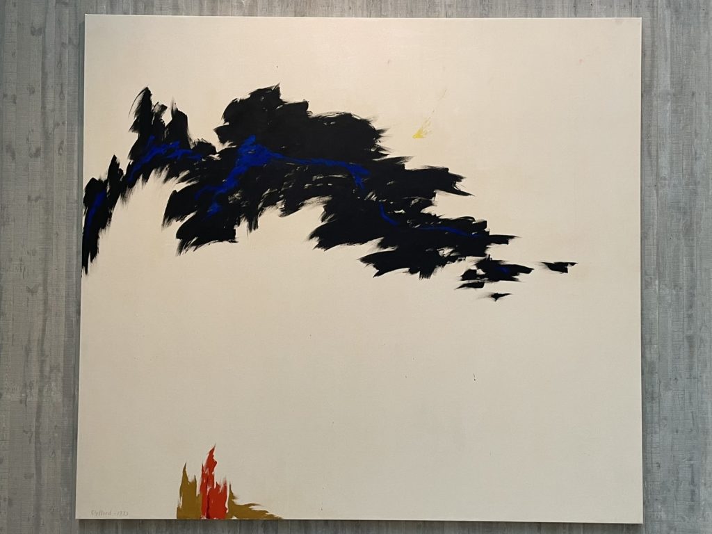
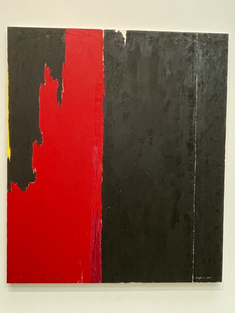
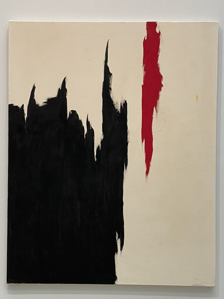
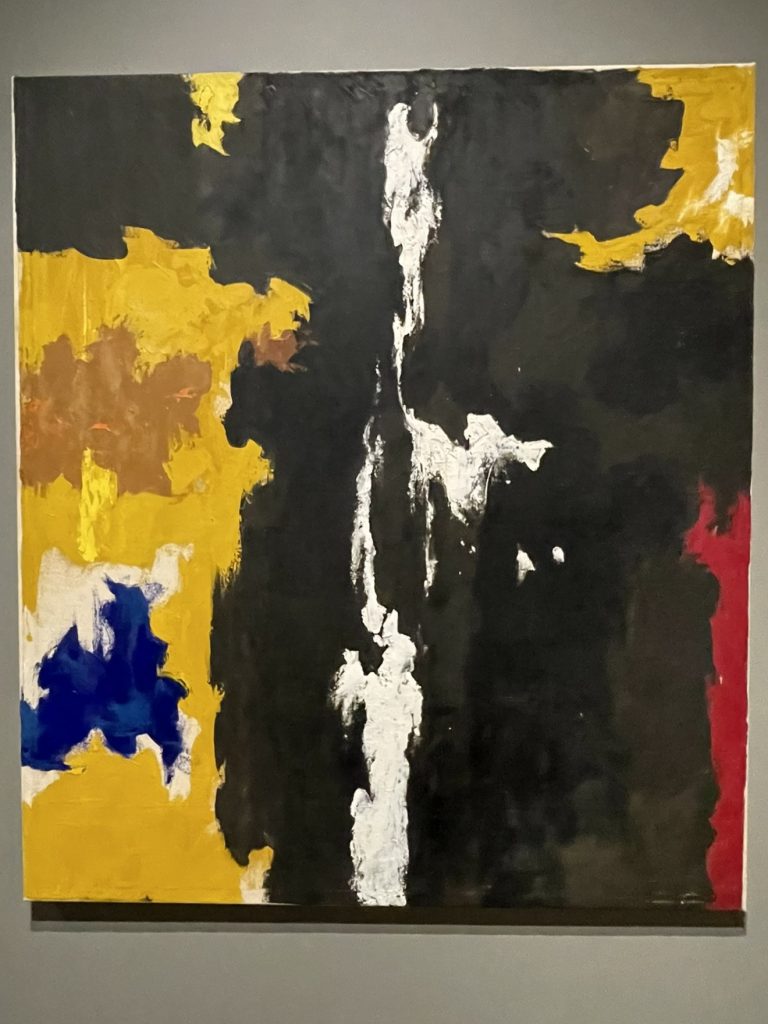
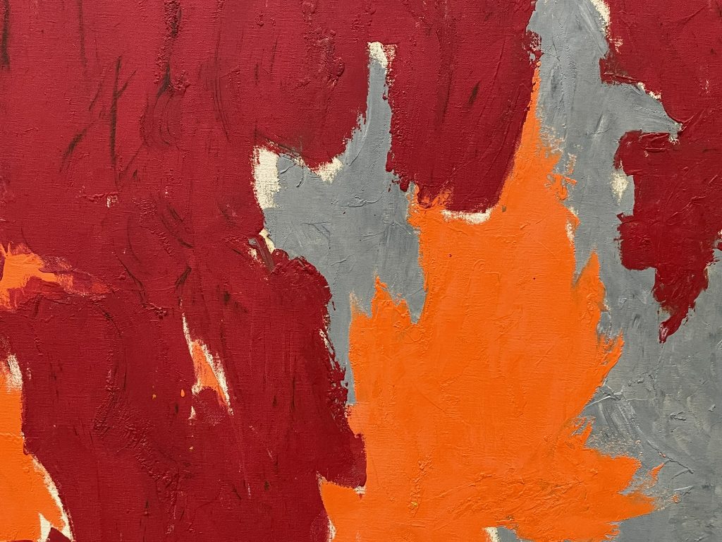
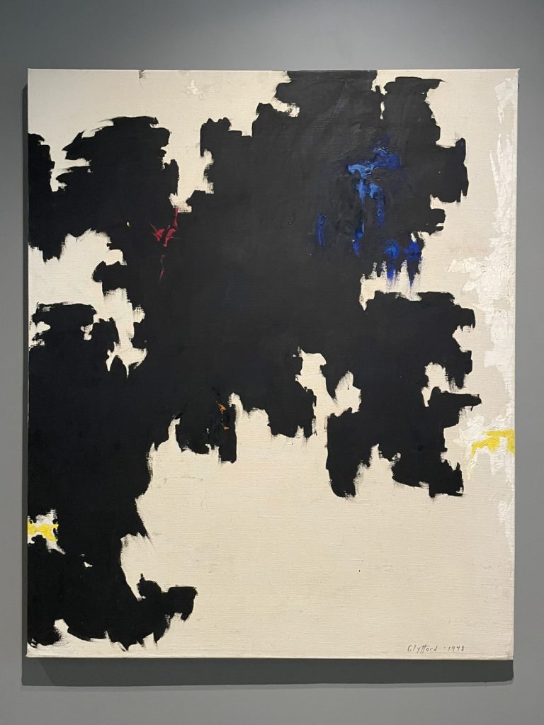
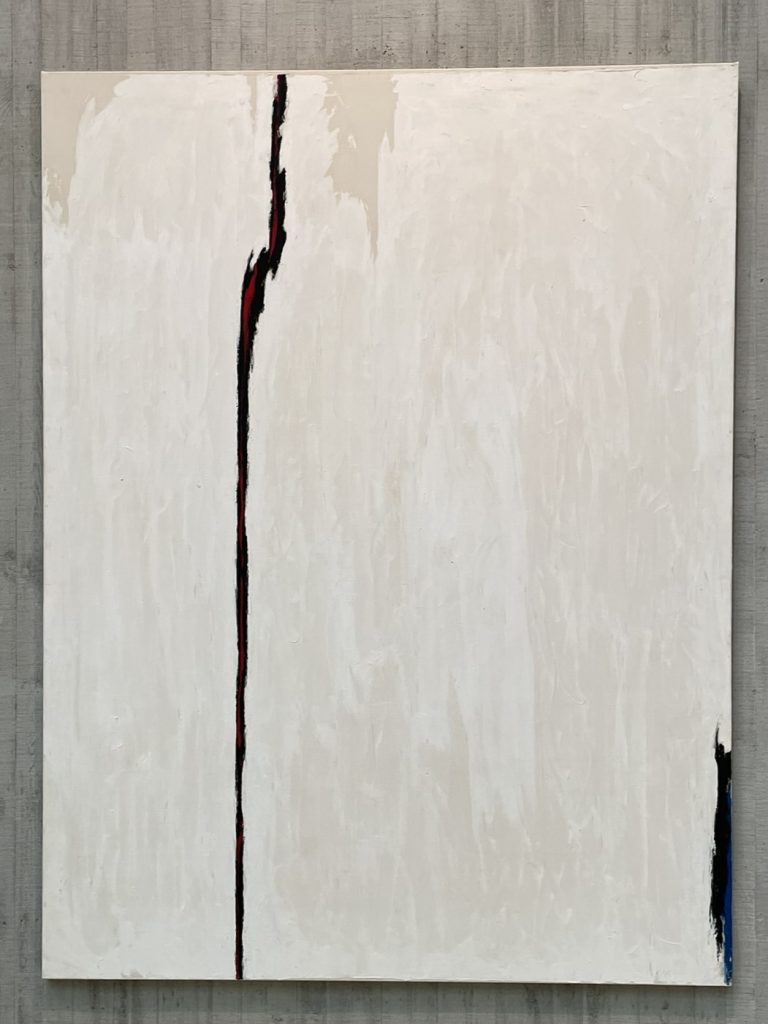
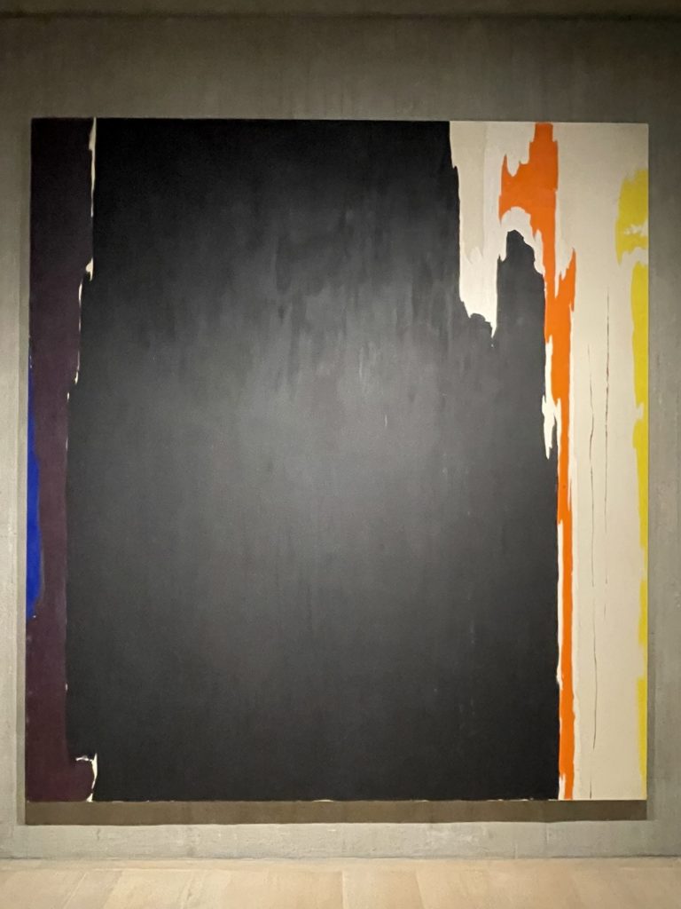
A note about the paintings and their titles in this post. After 1947, Still stopped naming his works, and removed the titles for all prior works; every item was labeled using Still’s numbering system. Additionally, most of the works on display were quite large, reaching floor-to-ceiling; it’s difficult to sense the scale in my pictures. The cover photo is PH-1092, 1979.


One thought on “Clyfford Still Museum”